Once again, I found myself hosting my family for an Easter brunch. I will admit I am starting to enjoy it more than just the decorating, but please don’t let me sign up for Christmas still.
I was really trying to work with a new color palette, but the heart wants what the heart wants, and we still ended up with some dark and moody in there.
When I showed my husband my mock up, though, he let me know it was “giving split pea soup” — but considering he’s the only one in this house that’s ever made split pea soup, that sounds like a you problem, buddy… if it was even supposed to be an insult.
So, anyway, me and my split pea green went off to curate a tablescape that would be simple and still make a statement — aside from “soup”.
Since the guest list was family, — and I could pretty much guarantee who would be there — I wanted to make some sort of cute seating card with everyone’s names. And I made them before even inviting everyone, so they’d also be forced to show up.
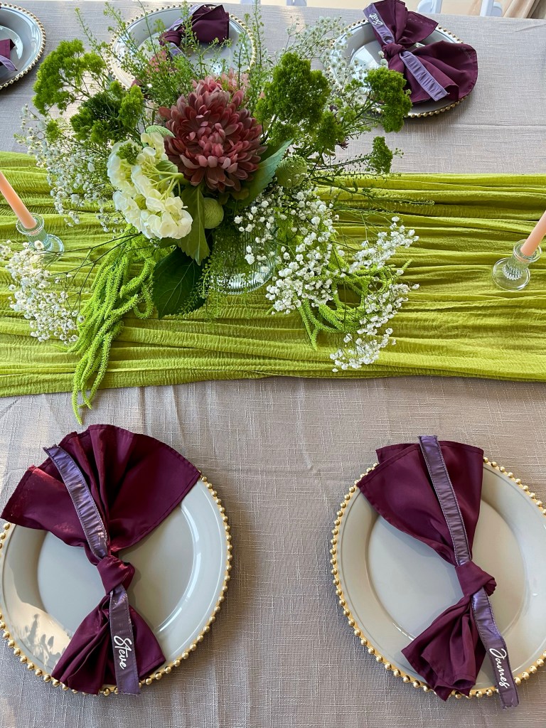
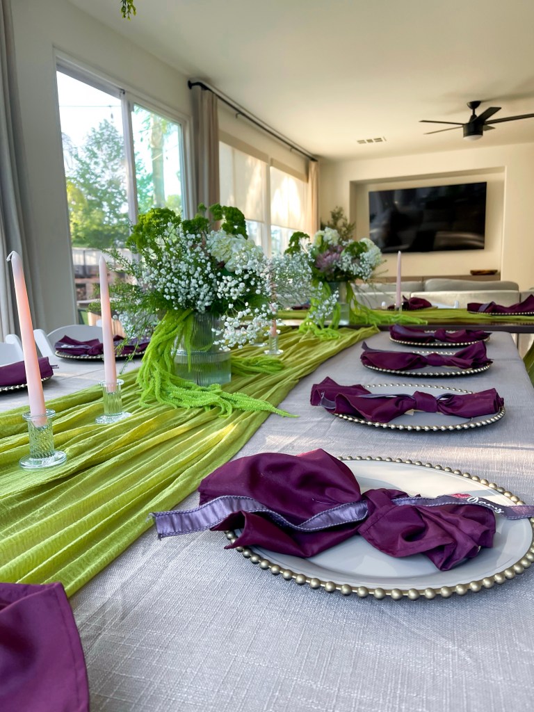
I decided on a classic napkin tie that I laced a ribbon through the knot. The ribbon I purchased was wired, so I pulled the wiring out so the ribbon would lay better, and then I added everyone’s name using HTV vinyl and a Cricut.
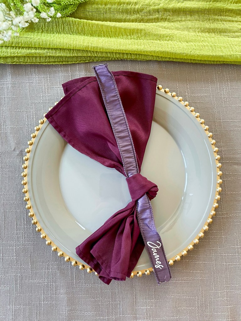
I always try to purchase table setting pieces that’ll work with a variety of themes, which is why this cream and gold charger plate was the perfect addition to my collection a few years ago, as I’ve used it multiple times now.
With a bold color pallete, I wanted to keep tablecloths neutral and natural with a gorgeous linen to be paired with — split pea inserts the chat — the gorgeous green table runners.
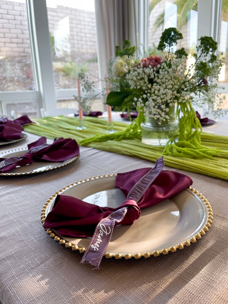
I found these stunning fluted vases a while back and had been dying to use them. I love that they’re a little elevated from a standard clear vase, but still plain enough to go with any tablescape.
Originally, I was wanting to incorporate a lot more deep purples and maroons into the florals, but because of the time of year, and keeping it easy, I focused on greenery for florals instead that I could get at Trader Joe’s, mixed in with a few faux flowers I already had lying around. And to tie it together, I used these faux trailing greenery pieces that matched the table runners.
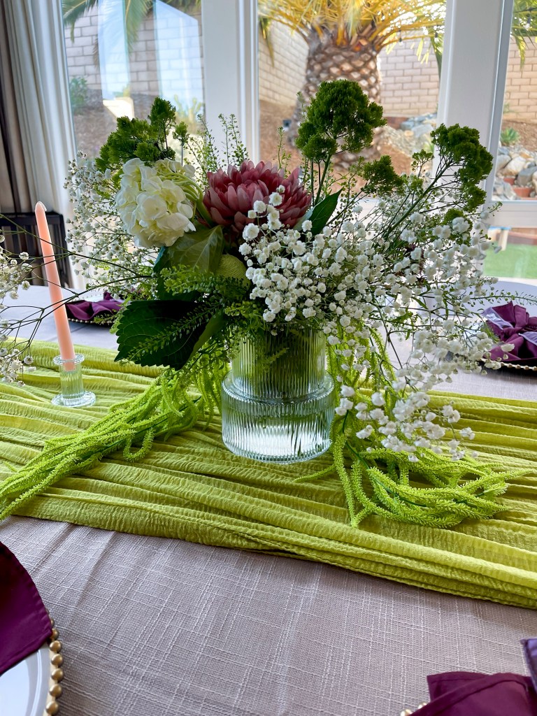
For a final little subtle pop, I used some candle holders that coordinated with the vases to hold some pale pink candles. To keep your design interesting, it’s important to use coordinating colors in the same palette, and not all just matching perfectly.
In the end, everything came together beautifully, — with no mention of soup — and I hope you’ve gained a little inspiration or creative idea for your next hosting event. You got this!